


You're Custom Text Here
Bill Gaspard and I collaborated with China Daily’s Shanghai bureau to craft this redesign of their then-defunct weekly entertainment tabloid, the Shanghai Star. The Star is sadly once again defunct, but its short run managed to win a redesign award from the Society for News Design.
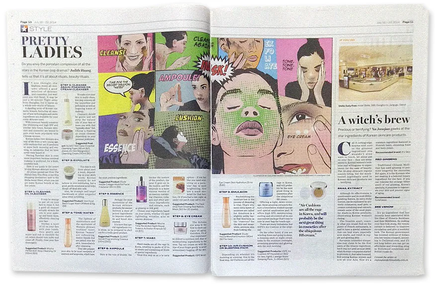
The bulk of the design — except for the folios — is by me.
I chose to use Benton Wide and Big Miller because those typefaces are essentially more feature-oriented versions of the type families that define the core China Daily product.
My key concerns were instituting a grid and bringing rigor to the typography. The previous design had no set standards for either.
I was also interested in iterating China Daily’s color palette, which at the time was a heavy blue, two shades of gray and a red. With the Star, we introduced orange and a lighter shade of CD blue.
The typography and color would eventually influence the main China Daily product, which launched a visual refresh in early 2015.
The spreads in this gallery were designed by me. I'd be remiss to not mention my frequent collaborator, Guillermo Munro. His illustration work alone or in collaboration with me often gave the Star a distinctive visual identity that the other entertainment weeklies in Shanghai couldn’t match.
Bill Gaspard and I collaborated with China Daily’s Shanghai bureau to craft this redesign of their then-defunct weekly entertainment tabloid, the Shanghai Star. The Star is sadly once again defunct, but its short run managed to win a redesign award from the Society for News Design.
The bulk of the design — except for the folios — is by me.
I chose to use Benton Wide and Big Miller because those typefaces are essentially more feature-oriented versions of the type families that define the core China Daily product.
My key concerns were instituting a grid and bringing rigor to the typography. The previous design had no set standards for either.
I was also interested in iterating China Daily’s color palette, which at the time was a heavy blue, two shades of gray and a red. With the Star, we introduced orange and a lighter shade of CD blue.
The typography and color would eventually influence the main China Daily product, which launched a visual refresh in early 2015.
The spreads in this gallery were designed by me. I'd be remiss to not mention my frequent collaborator, Guillermo Munro. His illustration work alone or in collaboration with me often gave the Star a distinctive visual identity that the other entertainment weeklies in Shanghai couldn’t match.