


You're Custom Text Here
Here’s a look at a few of the projects I designed for my friends at Mao Mao Chong, which is one of the best cocktail bars in Beijing.
The business cards feature an updated logo and imagery based on the artworks inside the bar. The typography is a carefully curated selection of English and Chinese typefaces that work together effectively.
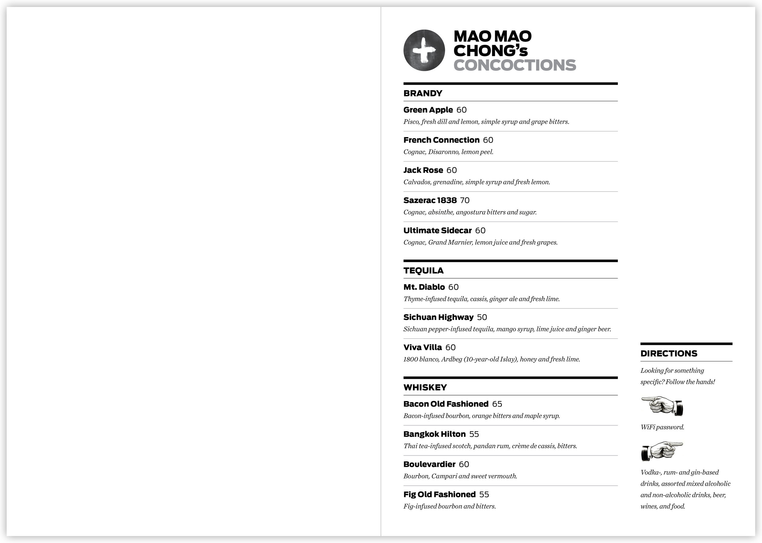
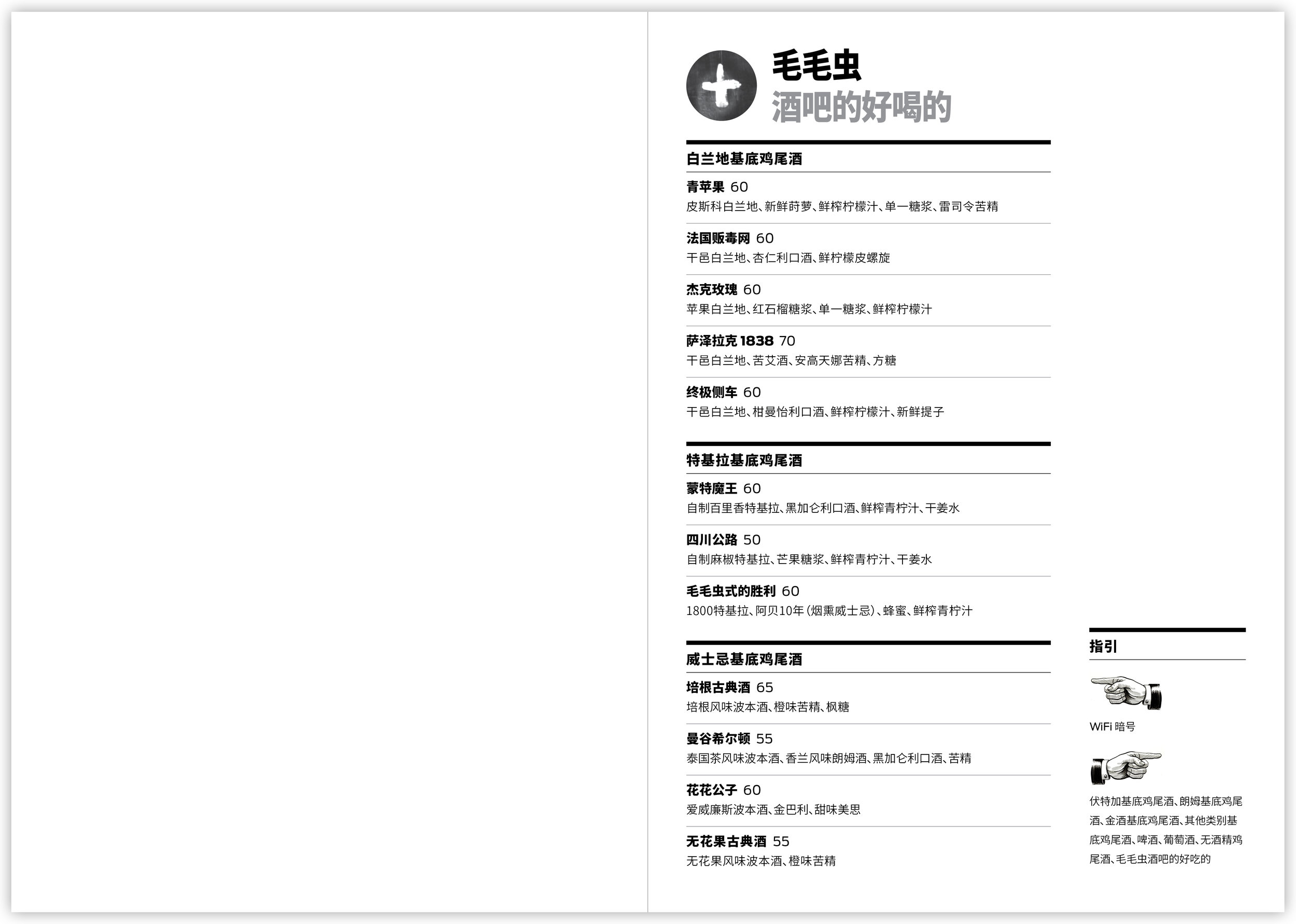
The menus were designed a year later as MMC began to market more to Chinese. The artworks-based imagery in the business cards returns here on a smaller scale. I added a serif typeface to move the menus to a more upmarket position. I also created a navigational tool for the menu, which features a dizzying array of drinks that can be overwhelming to new customers.
For convenience, a WeChat QR code is included on the last page so patrons may pay their tab directly to Eric via smartphone.
Here’s a look at a few of the projects I designed for my friends at Mao Mao Chong, which is one of the best cocktail bars in Beijing.
The business cards feature an updated logo and imagery based on the artworks inside the bar. The typography is a carefully curated selection of English and Chinese typefaces that work together effectively.
The menus were designed a year later as MMC began to market more to Chinese. The artworks-based imagery in the business cards returns here on a smaller scale. I added a serif typeface to move the menus to a more upmarket position. I also created a navigational tool for the menu, which features a dizzying array of drinks that can be overwhelming to new customers.
For convenience, a WeChat QR code is included on the last page so patrons may pay their tab directly to Eric via smartphone.
MMC business cards, front and back.
Menu cover overall design variants. Small text underneath the logo indicates whether it's the English or Chinese menu.
English menu interior.
Chinese menu interior.