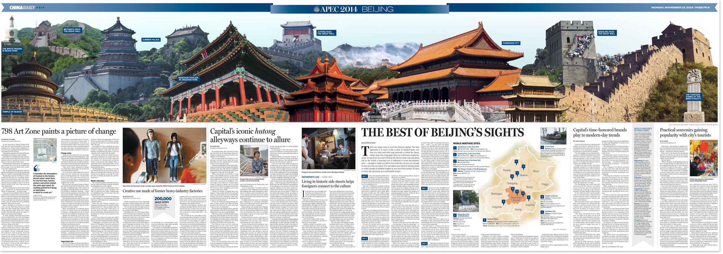
11.10.2014: APEC gatefold spread
This double-sided spread, which unfurls to the width of four broadsheets, was designed in two days. It won an award from the Society for News Design.
The content and photography was assembled as if the spread could be treated like eight regular news pages. I thought this approach was flawed. The spread is just too difficult to read like a newspaper. The only effective reading experience I could think of for such a size was for the spread to be treated like a poster.
With that in mind, I developed the lead visual concept: a faux-Beijing skyline with the past on one side and the present on the other.
Guillermo Munro helped me with a few of the many cutouts for the illustration I composited together, and also contributed the sky effects. Anci Feng Xiuxia designed one of the graphics.
I designed the rest.
The spread became the centerpiece and aesthetic inspiration for China Daily's extended APEC edition. That edition, published on November 10, would earn China Daily a gold medal for overall design from WAN-IFRA's Asian newspapers competition, beating out the venerable South China Morning Post.

